How strategic color choices increased conversion by 28% and reduced returns by 35%
Client
AestiHome
Services
Product Design,
UX Research, Color Strategy
Industries
E-Commerce
Date
Q2 2024
Study the problem
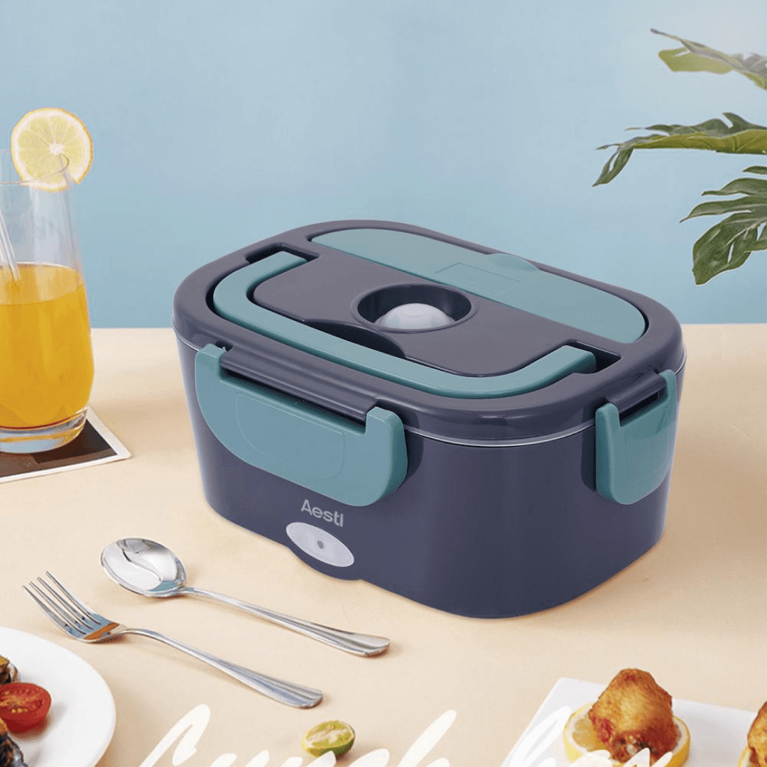
At AestiHome, our electric lunchbox had strong functionality but struggled with market adoption. Despite positive reviews for performance, we faced 18% return rates and conversion rates 23% below category average. In the old design, we offered only standard green option. Customer feedback revealed that 54% abandoned purchases due to "unappealing appearance," and return reasons often cited "color not as expected." The product looked generic and failed to communicate its premium positioning. My research suggested that our target audience — health-conscious professionals aged 25-45 — wanted colors that reflected their lifestyle aspirations. Analysis of user interviews and competitive landscape showed a gap for sophisticated, lifestyle-oriented color options in the portable appliance category.
The strategic approach
Design execution
A/B testing strategy
Design results
In working on this project, I learned that color strategy is not just about aesthetics — it's a powerful business lever that can drive premium positioning and emotional connection with users.